Trending
⭐ This is a premium feature. Please click here for more information.
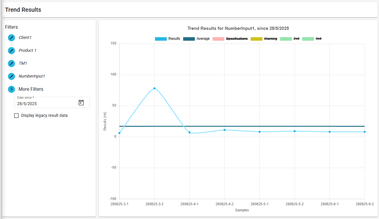
The trend is a feature that allows you to view a statistical summary of the selected test method outputs results. This helps to locate outliers in results, or to view the swing of results over time.
Contents
Viewing Imported Legacy Result Data
Test Method Versioning & Trending
Trending
To view the trend, users must have the Analytics: Trend permission.
To view the trend graph:
- Select
Analytics > Trendfrom the menu. - In the Filters section, select a client, a product, a test method and a test method output.
- Select a since date. The since date is the date from which data will be shown.
ℹ️ Results will be shown from the since date up until today’s date.
Once the filters have been defined, the graph will be shown automatically.
ℹ️ Results on the trend graph will only appear once the test’s results have been submitted.
Trending via Approve Samples
Trending can be viewed from the Approve Samples screen:
- On the approved sample row, select the [ Trend ] icon in the last column to be navigated to the trend screen.

- The client and product will be set automatically. You must select a test method and test method output.
Trending via View Test
Trending can be viewed from the View Test screen once the test’s results have been submitted:
- From the job list on the Dashboard, search and select the job relating to the test you wish to view.
- From the Sample Summary, select the sample relating to the test.
- From the Test Summary, select the test you wish to view.
- In the Output Summary, select the trend icon in the last column for the output you wish to view to be navigated to the trend screen.

- All filters will be pre-populated.
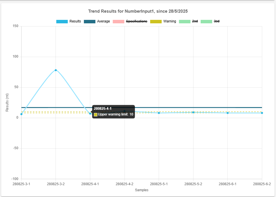
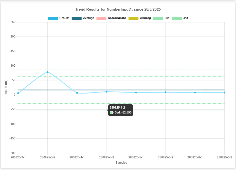
Interpreting the Trend Graph
The Y-axis consists of a range of values encompassing all results.
The X-axis displays samples in chronological order.
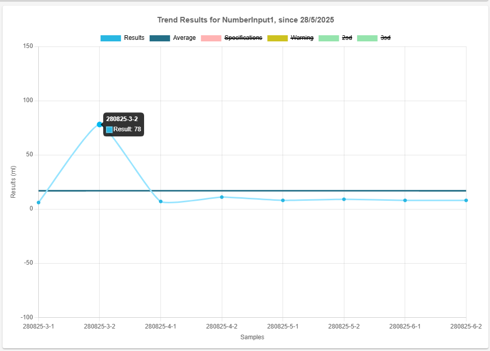
If a result is between 2 points on the Y-axis, you can hover over the point to display a tooltip showing the actual value of the result.
By default, the graph will display results and an average of the results. Additional line graphs can be toggled by clicking on the legend boxes. See Additional Graph Plots for more information.
Additional Graph Plots
Average
Toggled on by default. The average plots the average (mean) of the given set of results.
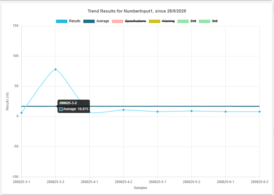
The formula for calculating the average is:
\$\mu = \frac{\sum_{i=1}^{n} x_i}{n}\$
Where:
\( x_i \)represents each individual result in the dataset.\( n \)is the total number of values.\( \mu \)is the average.
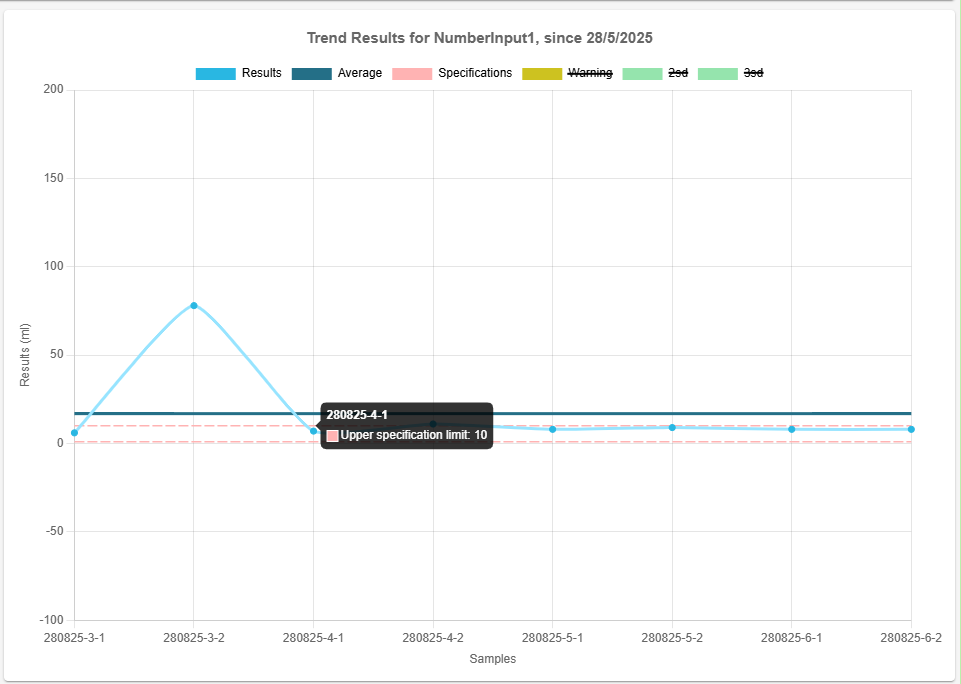
Specification limits
Toggled off by default. When available, specifications can be toggled on to show upper and lower limits. These will appear on the chart as a red dashed line.
These lines will use the values for the specification set on that particular sample, this means the lines will change as the product specification values changes.
Warning limits
Toggled off by default. Warning limits can be toggled on to show upper and lower warning limits. These will appear on the chart as a yellow dashed line.
These lines will use the values for the warnings set on that particular sample, this means the lines will change as the product trend values changes.
Deviations
By default, the deviation ranges for 2 standard deviations (2sd) and 3 standard deviations (3sd) away from the average are toggled off.
The formula for calculating the standard deviation (\( \sigma \)) of the result set is:
\$\sigma = \sqrt{\frac{\sum_{i=1}^{n} (x_i - \mu)^2}{n}}\$
Where:
\( \sigma \)is the standard deviation.\( x_i\)represents each individual result in the dataset.\( \mu \)is the average.\( n \)is the total number of values.
The lower and upper bounds of the standard deviation range are calculated using the formulas:
\[ \text{Lower Bound} = \mu - (Factor \times \sigma) \]
\[ \text{Upper Bound} = \mu + (Factor \times \sigma) \]
Where:
\( Factor \)refers to the multiplier used to scale the standard deviation away from the average.\( \mu \)is the average.
Viewing Imported Legacy Result Data
On the trend graph it is possible to combine results data entered through the LabHQ lifecycle with data imported into LabHQ (see Import Results Data for instructions on importing results data to LabHQ).
To include imported results on the trend graph, select the Display legacy result data toggle at the bottom of the page.

Imported result data on the trend graph is color-coded to distinguish it from data entered through the LabHQ lifecycle.
📒 Imported results data can only be displayed on the trend graph when at least one result with a matching client, product, test method, and test method output has been entered via the lifecycle of LabHQ.
Downloading Trend Data
You can download and save an image file of the trend graph by right-clicking on the graph and selecting [ Save image as ] in the context menu.
Test Method Versioning & Trending
All results belonging to the same test method will appear on the trend graph. Different versions of the test method will all display on the same trend graph.